Makrverse
UI/UX Designer
Tel-Aviv, Israel 🇮🇱
Project Overview
Makrverse is a startup that has received funding from a venture capital firm known as "Initiator VC.”
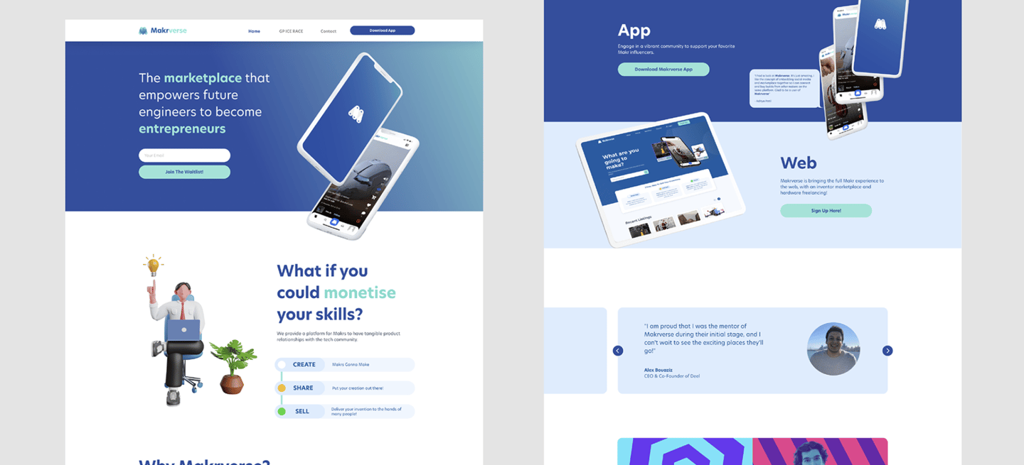
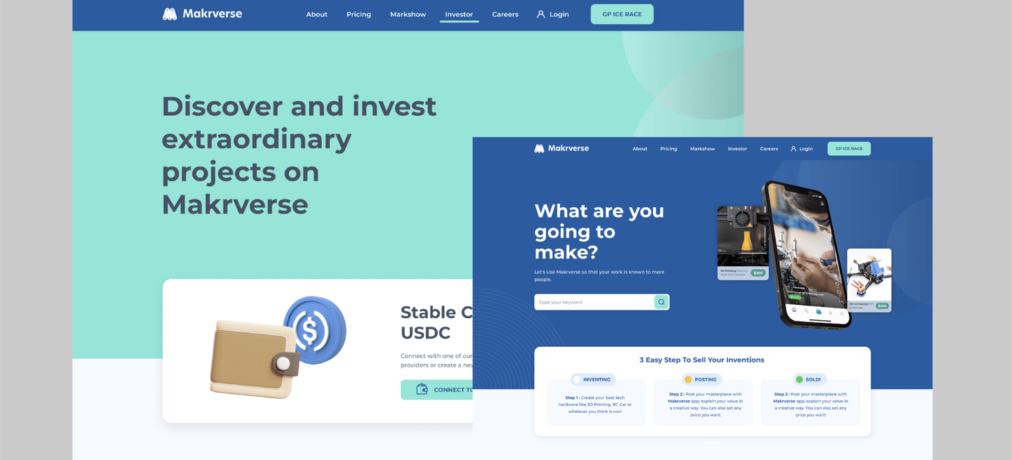
Makrverse is the social media marketplace for inventors and tech enthusiasts. It aims to bridge the gap between those who build and those who buy.
Makrverse offers community and commerce in the same place, it allows you to try it the newest tech. The platform offers functions such as sharing, requesting, exploring, and exchanging.
Makrverse solves the problem of where an inventor goes to sell his projects and where an enthusiast goes to request products. The plan is to become the platform for hardware freelancers. In the end, Makrverse was born as the result of the actual needs the founding team had and knew that affected so many other people. There are many features that will be added, this is just the beginning so be an early adopter of the platform for early adopters.
Year Project
Role
2022
My Role:
Customer Insights & Ideation
I partnered with project manager to uncover insights and translate concepts into features that address customer behaviours and motivations.
Experience Strategy & Vision
I created frameworks and prototypes to share the vision, design principles and content strategy. This helped to evangelise ideas, gain alignment and drive decision making.
Planning & Scope Definition
I defined the product with my project manager partners. I evangelised customer goals and balanced business goals. I prioritised and negotiated features for launch and beyond.
Design Execution & Validation
I designed down on Web & iOS. I executed journeys, wireframes, prototypes and design specs.
Oversight & Coordination
I designed across and collaborated with PM to translate product features for each platform context.
Challenges:
To be successful in today's rapidly evolving business landscape, developing a Minimum Viable Product (MVP) has become crucial. An MVP allows companies to create a basic version of their product, test it with customers, and gather feedback before investing significant resources into a fully developed version. This approach enables businesses to identify and address potential issues early on, which can save them time and money in the long run. Additionally, with the rise of web3 and the increasing popularity of decentralized finance (DeFi), integrating a marketplace with payments using USDC can further enhance the user experience. This not only provides a secure and transparent way of making payments but also offers a unique opportunity for businesses to tap into the growing DeFi market. By leveraging these emerging technologies, companies can create innovative and efficient solutions that drive growth and success
The Approach:
Easy to use, MVP fit
Design Process:
Used the Design Thinking approach for solving this problem. To practice design thinking we followed the below process


The Process : Breakdown The Feature
When approaching the development of an MVP, it is essential to conduct a thorough analysis of existing applications. By dissecting these products, one can identify the key features that contribute to their success or shortcomings. This process involves retracing each feature and assessing whether it can be improved or eliminated to enhance the user experience. Through this approach, businesses can create a lean and effective MVP that is tailored to meet the needs of their target market. Additionally, this method can help companies to identify potential areas of improvement that can be addressed in future iterations of the product. By leveraging this approach, businesses can develop MVPs that are efficient, intuitive, and highly effective in meeting the needs of their users.
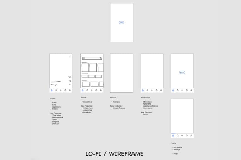
The Process : The High Fidelity
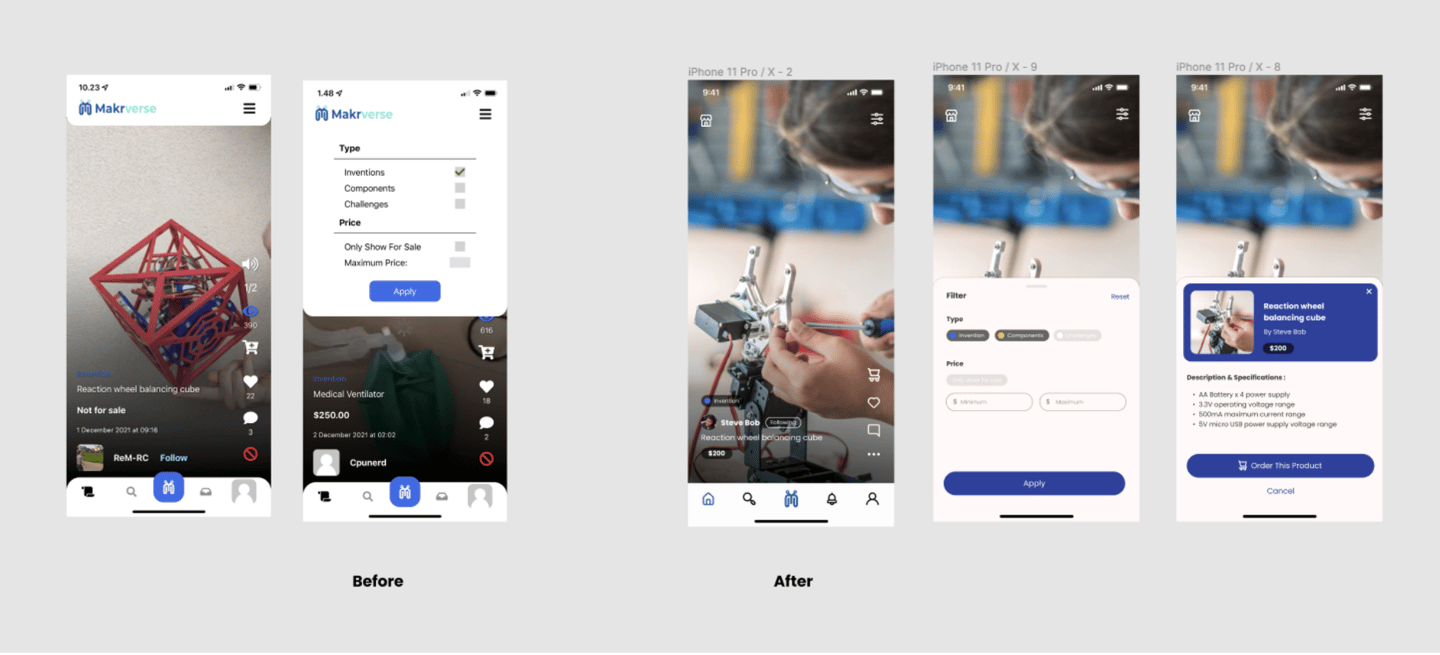
Following a thorough overhaul of the previous design, the updated version now boasts very few drawbacks from the previous iteration. Some of the most significant issues addressed in the redesign include the disproportionate size of the buttons, the menu bar that takes up too much space, and an overly rounded interface. The result of this redesign is an application that is not only aesthetically pleasing but also highly functional and user-friendly. The redesign has addressed the previous design's shortcomings and made it easier for users to navigate the application, thus improving the overall user experience. This updated design is a testament to the importance of listening to user feedback and continually improving and iterating on existing products to provide the best possible experience for users
Let's Collaborate!
📩 pridatirta@gmail.com