Hifella
UI/UX Designer


Surabaya, Indonesia 🇮🇩
Project Overview
Hifella is a global trade hub. Connecting with a vibrant community of export-import enthusiasts, explore a vast product database, and showcase your business at our dynamic online exhibitions. We're building a seamless platform that empowers businesses to thrive in the interconnected world market.
Year Project
Role
2024
Challenges:
The company was facing a significant hurdle: while many users started the registration process, a considerable number were dropping off before completing it. Analysis revealed that users were getting stuck towards the end of the registration flow, leading to a frustrating experience and hindering user acquisition efforts.
Goals:
Our primary goal was to make the registration process seamless and user-friendly without compromising the necessary steps. We aimed to enhance user experience, ensuring a smooth journey from start to finish.
Phase 1: Discovering the Roadblocks
We embarked on a detailed analysis of the existing registration flow, which consisted of 10 mandatory steps:
Enter Email
Set Password
Confirm Email
Complete Information (input phone number)
Receive OTP on Phone Number
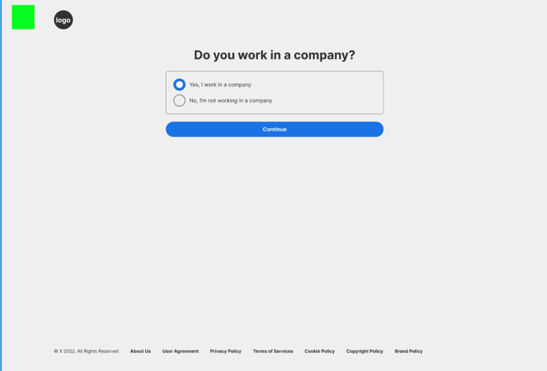
Answer: Do you work for a company?
Create a company page on the platform
Choose a product category
Complete profile (add username and photo)
Follow recommendations
Through this analysis, it became clear that the complexity and length of these steps were overwhelming users and causing frustration


Old Registration Flow
Phase 2: Redesigning for Simplicity
We knew that to address these issues, we needed to rethink and simplify the registration process. Our approach involved consolidating and prioritizing the steps to create a more intuitive and efficient flow. After extensive research and redesign, we reduced the registration process to 5 streamlined steps:
Enter Email and Password
Complete Name
Confirm Email
Add Essential Details (phone number and other relevant information)
Choose Product Categories
By focusing on these key steps, we maintained all necessary information while significantly reducing the time and effort required from users.


After Revamp Registration Flow
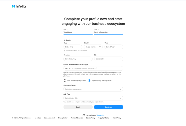
New Details Information + Question Section


Moving the 'Create Company Page' step to after the user enters the home screen has resulted in a shorter registration flow
Old Question Section
Results
The impact of our redesigned registration flow was profound. Within just one week of implementing the new process, user registrations surged by 50%. This improvement not only enhanced user satisfaction but also contributed to the company’s overall growth and success.
Let's Collaborate!
📩 pridatirta@gmail.com